PLEASE WAIT FOR PICTURES TO LOAD
| On this page I take a photo through the various
stages of fixing it up for the internet. Please note that I used
Paint Shop Pro 13 to do this. The steps you would take are somewhat different in Adobe Photoshop Elements. To fully appreciate what you're seeing, you will need to pan to the right to look at the larger photos. |
|
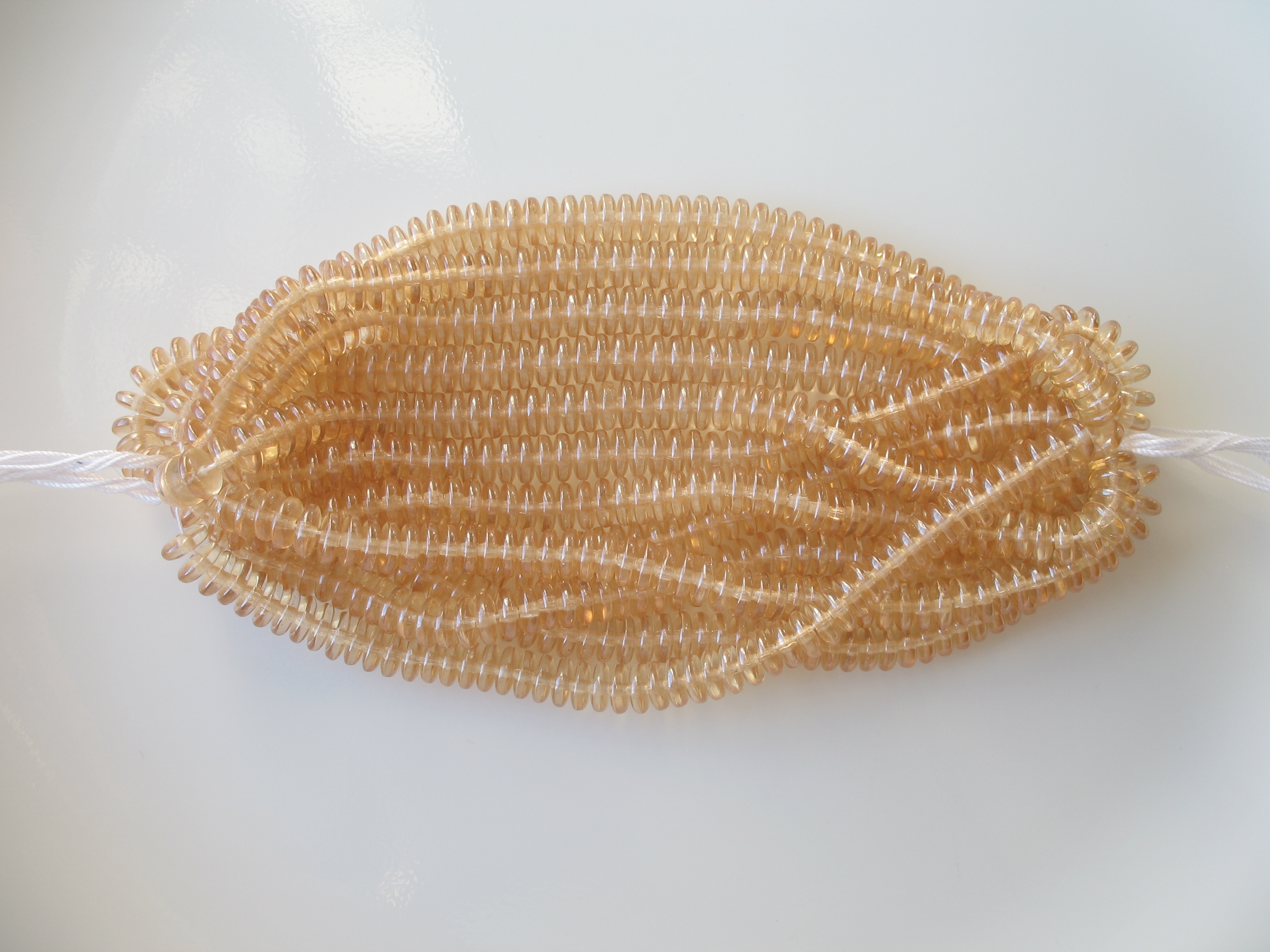
The camera was set to take a full-sized image (no optical or digital zoom), with the least compression (Superfine setting), and was set on Macro (for close-ups). I took pictures at several different Exposure Compensation settings, and this photo came closest to what I wanted.  |
|
fix it, for which I used the White Balance feature of my photo-editing program (usually called "White Balance" in other programs). Commonly, digital pictures will come out too yellow, too blue or – as in this case – a little green. If your photo-editing program doesn't have a White Balance feature, you'll have to manually adjust the red, green or blue color channels until the picture looks right. If you took the picture on a white background, then adjust the picture until the background looks neutral.  |
 |
|
noise or grain is common with point-and-shoot digital cameras. The picture above is mostly noise-free, so I didn't need to adjust it. This is a step you probably won't need to take. |
|
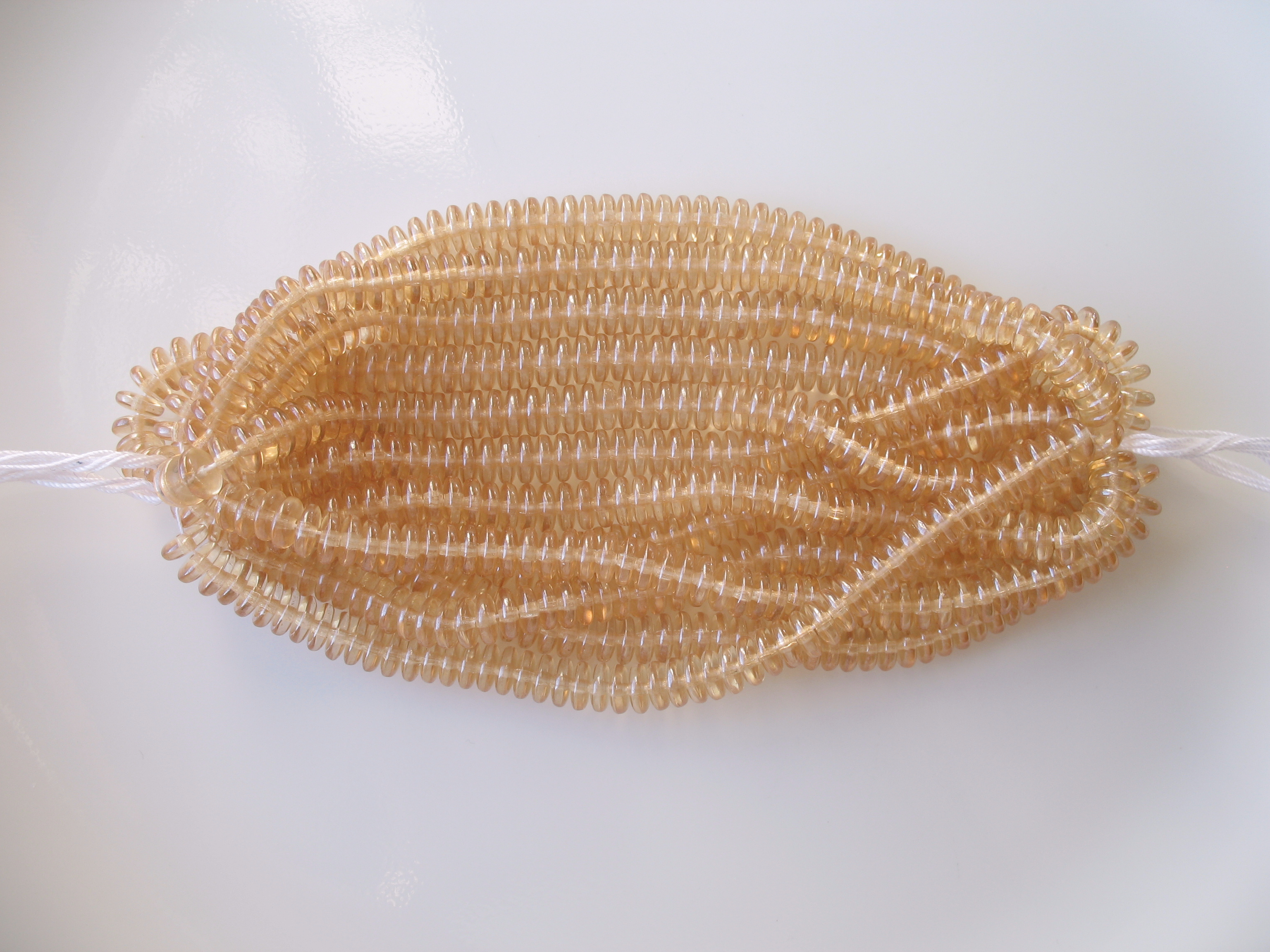
it. In this case, the actual beads are lighter than the picture indicates, so I had to lighten the photo. (Note: On my new LCD monitor, the original picture looks bright enough, and I wouldn't have changed it.) Paint Shop Pro has a feature called Histogram Adjustment (it was called Gamma Correction in previous versions). It lightens and adds contrast at the same time, so I used that feature on this picture. Both Paint Shop Pro and Photoshop Elements have a Lighten Shadows feature which often works well. Important: Please note that the colors of the beads become brighter (richer) when the picture is lightened.  |
|
This picture doesn't need a lot of contrast, but contrast is good because it makes a picture look less dull and hazy, so I used some. Please note that using contrast also makes the colors in a picture look richer and brighter. If you use the Lighten Shadows feature, adding contrast may not be necessary.  |
|
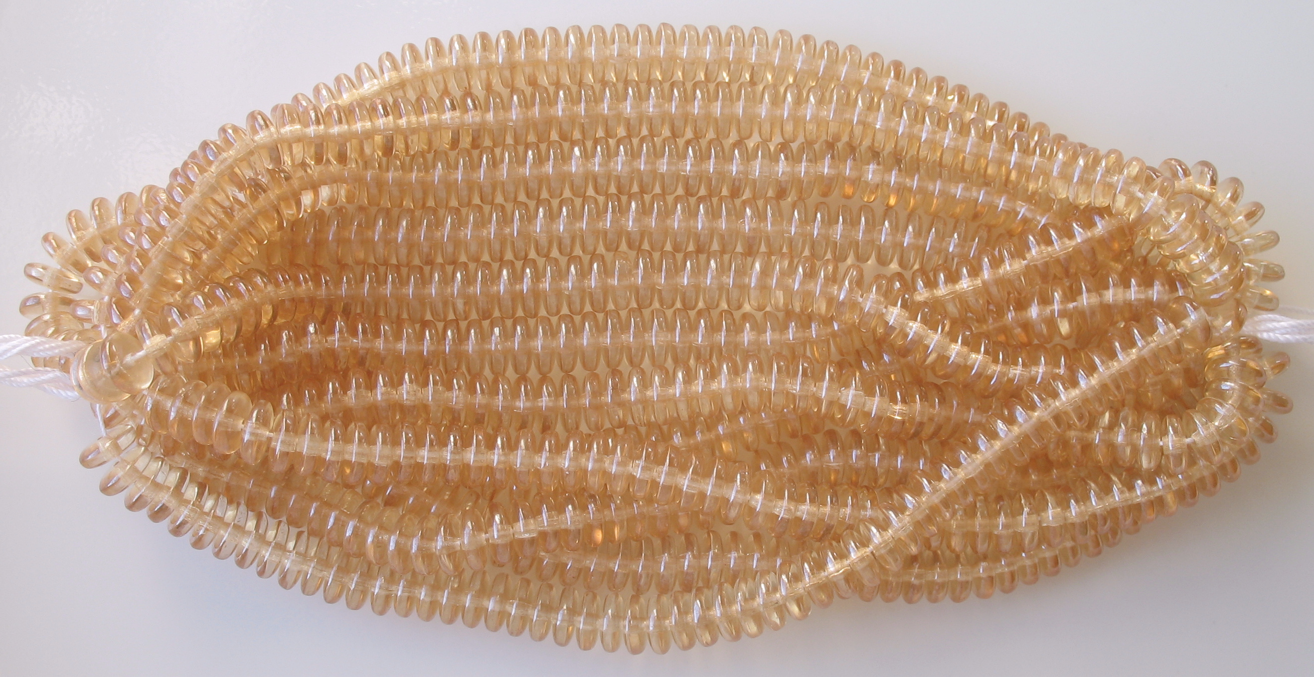
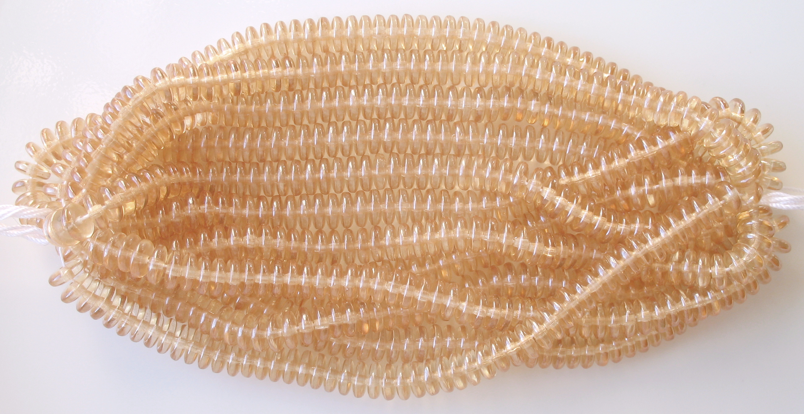
cameras produce pictures with over-saturated colors. Also, lightening and then adding contrast to a picture will make the colors in the picture become too bright and saturated. You fix that by reducing the color saturation. I compared the actual beads to the picture above and saw that the color of the beads was not so bright and rich, so I reduced the color saturation. The picture below is the way the beads actually look. Not all photo-editing programs have a color-saturation feature. (Please note that producing pictures with over-saturated colors will make your jewelry look better than it is, which may improve your sales. However, your customers may be disappointed when they receive your jewelry, and you may get more returns than you otherwise would.)  |
|
people's screens, you will need to shrink it. Then I shrank the picture to 1250 pixels wide. 1250 pixels is rather large, but it is necessary for the customer to see the details. When resizing a picture, you have to make sure the photo keeps the same "aspect ratio" (proportions). Most photo-editing programs do that for you automatically.  |
|
ing makes all the difference, as it makes the item look more real. Please note that even if your camera produces sharp pictures, you'll need to re-sharpen the picture after resizing it.  |
 |
| Add JPG
compression. After working on a photo, you will want to save the picture on
your
hard drive as a "master"
in a non- compressed format (such as TIF or PNG) and then save a copy to the directory that will be uploaded to the internet in the JPG format. When saving the JPG copy, your program will give you the option of applying a lot of compression (which reduces the file size [in kilobytes] a great deal but makes the picture look blurry) or a little compression (which reduces the file size less but keeps the picture looking clear). I am a firm proponent of posting clear pictures, so I compress photos only 6% in Paint Shop Pro (that's enough to cut the file size in half). Please note that Photoshop Elements uses a completely different scale; in that program, 10% compression should be enough. |
|
see the full-sized image. A good technique is to use just a portion of the picture as the thumbnail (instead of shrinking the entire image). On the left, below, is a thumbnail made from a portion of the picture. On the right is the entire picture shrunk to thumbnail size. I think the thumbnail on the left is much better. If you are making a thumbnail of a necklace, then put the pendant or a focal bead in the thumbnail.
Here is another example of using a portion of an image as the thumbnail:
|